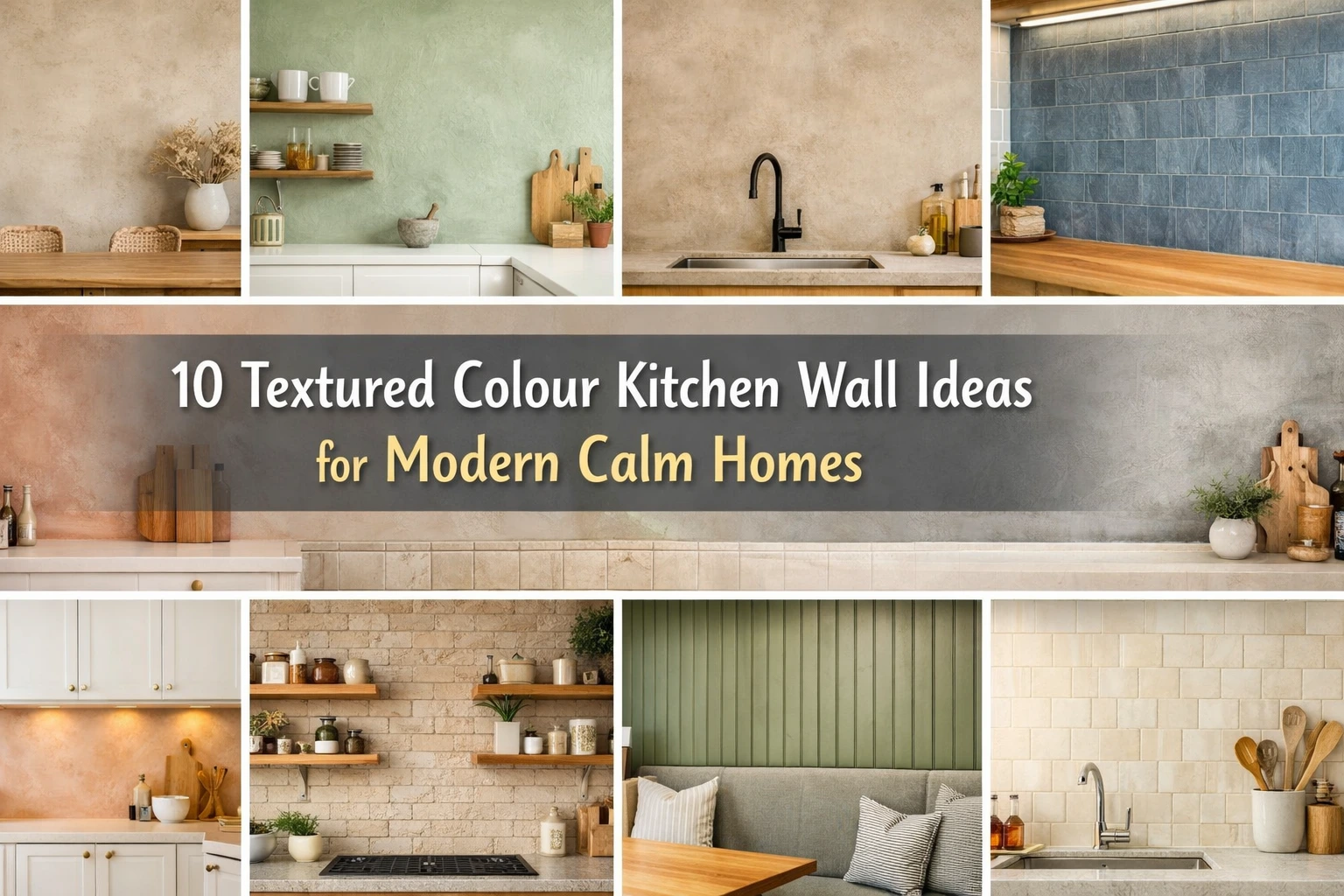
Textured Colour Kitchen Wall Ideas : Most kitchens in the UK don’t lack colour — they lack depth. I see this a lot, especially in newer builds or renovated homes: the cabinets are fine, the layout works, the appliances are modern… yet the room feels flat. Almost unfinished. In many cases, the walls are the reason.
Flat paint, even in a nice colour, doesn’t always hold up in a kitchen. Light changes constantly, steam builds up, and plain colour can start to feel cold. What works better — and lasts longer visually — is colour with texture.
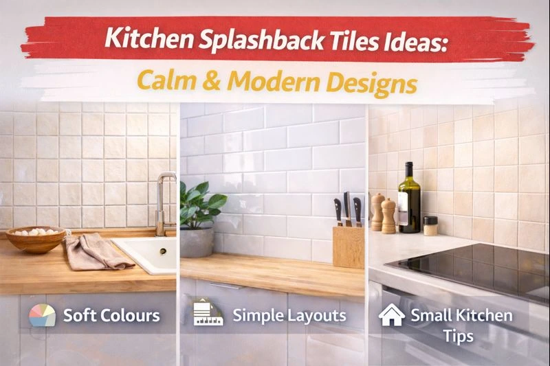
This guide is for UK homeowners who want a kitchen that feels calm and modern, not trendy or noisy. Everything below is based on real homes, real lighting, and real cleaning habits.
Before You Start: One Simple Rule That Matters
From experience, the calmest kitchens follow one rule:
use one textured colour as the anchor — not many competing finishes.
Texture should support the space, not dominate it.
1. Warm Greige Limewash Walls
Greige (a soft mix of grey and beige) with a limewash finish gives movement without looking patterned. It works especially well in UK light, where pure grey can feel dull.
Why it works: the uneven finish stops the wall from looking flat, even on cloudy days.
Best place: dining side of an open-plan kitchen.
Image idea: Greige limewash wall with oak table and white cabinetry.
2. Soft Sage Green Plaster Finish
Sage green is calming without being boring — but only when it’s muted and textured. A plaster-style finish softens the colour so it doesn’t look painted-on.
Why it works: green tones are easy on the eye and pair naturally with wood.
Avoid: bright or glossy green — it kills the calm.
Image idea: Sage textured wall behind open shelves.
3. Beige Microcement Walls
Microcement in beige or sand tones gives a seamless, modern look without feeling industrial. I’ve seen this work beautifully in kitchens where people want calm but hate visible joins.
Why it works: no grout lines, no visual clutter.
Reality check: this needs a skilled installer.
Image idea: Beige microcement wall with black tap and pale stone worktop.
4. Dusty Blue Textured Tiles
Flat blue can feel cold. Textured blue tiles — especially handmade-style ones — catch light and soften the colour.
Best for: splashbacks, not full walls.
Why it works: texture breaks up the colour so it doesn’t dominate.
Image idea: Dusty blue raised tiles under warm under-cabinet lighting.
5. Pale Terracotta Polished Plaster
Terracotta doesn’t have to look rustic. When kept pale and polished, it adds warmth without heaviness.
From real homes: this works best in kitchens with lots of white or cream cabinetry.
Image idea: Soft terracotta plaster wall with white units and brass handles.
6. Mushroom-Coloured Brick Slips
Brick texture painted in mushroom or stone tones feels grounded and timeless. It suits UK period homes especially well.
Why it works: texture adds character without strong colour contrast.
Image idea: Soft taupe brick wall with open oak shelving.
7. Muted Blush Textured Paint
Blush pink sounds risky, but when muted and textured, it reads as warmth rather than colour.
Why it works: it reflects light gently, especially in north-facing kitchens.
Image idea: Subtle blush wall paired with pale wood cabinets.
8. Olive Green Reeded Panelling
Vertical reeded panels painted olive green add structure and calm rhythm to a space.
Best for: seating areas or breakfast bars.
Mistake to avoid: using it everywhere — one wall is enough.
Image idea: Olive fluted wall behind bench seating.
9. Stone Grey Venetian Plaster
Stone grey with plaster depth works when flat grey fails. It adds softness without darkening the room.
Why it works: texture stops grey from feeling lifeless.
Image idea: Grey plaster wall with marble counters and warm lighting.
10. Warm White Textured Tiles with Subtle Glaze
If you want colour without “colour”, this is the safest option. Warm white tiles with surface texture add depth quietly.
Best for: small kitchens or low-light spaces.
Image idea: Warm white textured tiles reflecting daylight.
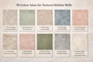
Here is 10 textured colour kitchen wall ideas chart
Common Mistakes I See (and How to Fix Them)
-
Too many textures: choose one hero wall.
-
Rough finishes near the hob: use sealed plaster or tiles there.
-
Testing colour only once: always check morning and evening light.
Simple Checklist Before You Commit
-
Does the colour still feel calm at night?
-
Can I clean it easily?
-
Is this texture supporting the kitchen — or shouting?
Takeaway
A calm kitchen isn’t about bold colour or expensive finishes. In UK homes, the most successful kitchens use soft colour + gentle texture, placed with intention. One textured wall done well will always age better than five trendy ones.
Read This Also: Interior Design Ideas in Budget: Low Cost Tricks That Actually Work
FAQs
Q1. What are textured colour kitchen wall ideas?
Textured colour kitchen wall ideas combine soft colours with surface texture like plaster, tiles, or panels to add depth and calm instead of using flat paint alone.
Q2. Are textured colour kitchen wall ideas suitable for small kitchens?
Yes. Light shades with subtle texture work well in small kitchens and often make the space feel deeper rather than crowded.
Q3. Which textured colour kitchen wall ideas are easiest to maintain?
Textured tiles and sealed plaster finishes are the most practical textured colour kitchen wall ideas because they are durable and easy to clean.
Q4. Can textured colour kitchen wall ideas look outdated quickly?
They won’t if you choose natural, muted tones. Trendy or very bold colours are more likely to date than textured neutrals.
Q5. How many textured colour walls should a kitchen have?
Usually one feature wall is enough. Too many textured colour kitchen wall ideas can disturb the calm balance of the space.