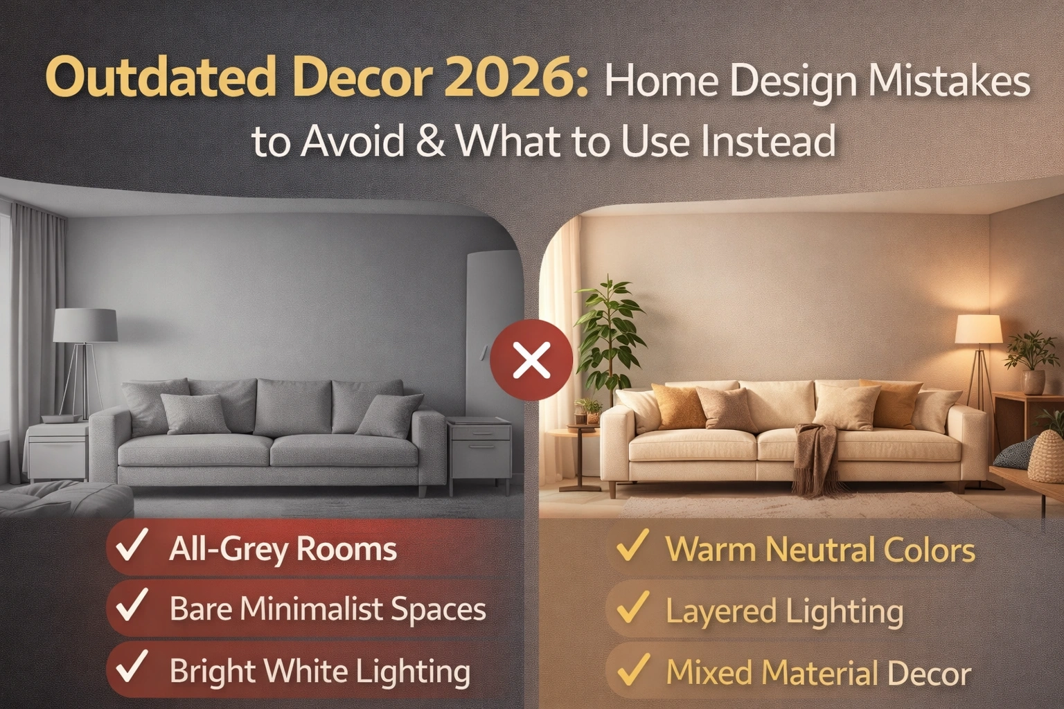
Outdated Decor 2026: If you’ve been staring at your living room thinking, “Why does this feel flat?” you’re not alone. I’ve noticed this a lot in real homes—both in India and the US. People did what worked for the last few years: clean lines, neutral tones, minimal accessories. But many spaces ended up looking cold, unfinished, or strangely “hotel-like.” The good news is you don’t need a full renovation to fix it. You need better choices in texture, warmth, and personality.
This guide is for anyone planning a refresh—new paint, furniture upgrades, or even small decor changes—who wants to avoid wasting money on trends that already feel dated.
Step 1: Stop aiming for “perfect neutral” rooms
Outdated: All-grey or all-white everything
Grey-on-grey rooms (grey sofa, grey walls, grey curtains) can look dull fast, especially in Indian light conditions or apartments with limited sunlight. In the US, it often reads as “builder-grade flip.”
Replace with: warm neutrals + layered tones
Think cream, sand, warm beige, soft clay, muted olive, or warm taupe. Even if you love neutrals, add one deeper shade (coffee brown, charcoal, deep green) to ground the room.
Why it matters: Warm tones make a home feel lived-in, not sterile.
Step 2: Avoid “cold minimalism” that looks empty
Outdated: Minimalist rooms with no character
Minimalism isn’t “wrong,” but many homes took it too literally—bare walls, one small rug, one accent piece. The result: the room feels incomplete, and sound echoes.
Replace with: calm-but-layered spaces
Keep it simple, but add:
-
a textured rug
-
one large art piece (not tiny frames floating on a big wall)
-
a throw + cushion mix
-
plants or natural elements
Why it matters: Texture is what makes a simple room feel rich.
Step 3: Say goodbye to matchy-matchy sets
Outdated: Full furniture sets that all look the same
Matching sofa set + matching center table + matching side tables can feel dated because it looks like a showroom, not a personal home.
Replace with: curated mixing
Try a mix of:
-
one hero piece (sofa or dining table)
-
different but complementary side tables
-
mixed materials (wood + metal, cane + upholstery, marble + timber)
Why it matters: Mixed pieces add depth and make the space feel more “collected over time.”
Step 4: Stop using harsh, overly cool lighting
Outdated: Bright white tube lights everywhere
This is one of the fastest ways to make any decor look cheap. It also makes skin tones look tired and rooms feel clinical.
Replace with: layered lighting
Use a 3-layer approach:
-
ceiling light (ambient)
-
table/floor lamp (soft)
-
warm accent light (corner or wall wash)
Why it matters: Lighting decides whether your home feels cozy or cold—more than furniture does.
Step 5: Avoid fast decor that looks “copied”
Outdated: Generic wall stickers, random quote frames, artificial plants everywhere
These items often feel outdated because they don’t connect with the home’s style or the people living there.
Replace with: personal + practical decor
-
one meaningful photo wall (not 20 tiny frames)
-
one large mirror for light and space
-
real plants where possible (snake plant, pothos)
-
handmade decor (terracotta, brass, local crafts in India)
Why it matters: Homes feel modern in 2026 when they feel human, not copied.
A quick replace-it table (save this)
| Outdated in 2026 | Replace with |
|---|---|
| All-grey rooms | Warm neutrals + one deep accent |
| Bare minimalist corners | Layered textures + one statement piece |
| Matching furniture sets | Mixed materials + curated pieces |
| Cool white lighting | Warm layered lighting (3 levels) |
| Generic quote decor | Meaningful art, mirrors, real plants |
Common mistakes I see during renovations (and easy fixes)
Mistake: Buying decor first, then trying to “fit” it later.
Fix: Decide your base: wall color + main furniture tone, then add decor.
Mistake: Choosing style over comfort (hard sofas, slippery rugs).
Fix: Sit-test furniture and pick rugs that feel good underfoot.
Mistake: Ignoring climate.
Fix: In humid Indian cities, choose breathable fabrics and avoid heavy velvet everywhere. In colder US regions, layering throws and rugs helps.
Takeaway: 2026 homes feel warm, textured, and personal
The big shift is simple: people are moving away from spaces that look perfect on a catalog page and toward spaces that feel comfortable in real life. You don’t need to throw out everything. Start with paint warmth, better lighting, and adding texture.
Internal linking ideas for your site: “small living room layout ideas,” “best paint colors for Indian homes,” “budget bedroom refresh,” “lighting guide for cozy homes.”
Also Read This: 10 Textured Colour Kitchen Wall Ideas for Modern Calm Homes
Q1. What is considered Outdated Decor 2026?
Outdated Decor 2026 includes all-grey rooms, empty minimalist spaces, matching furniture sets, harsh white lighting, and generic decor that lacks personality.
Q2. How can I avoid Outdated Decor 2026 in my home?
To avoid Outdated Decor 2026, use warm neutral colors, layered lighting, textured fabrics, and a mix of furniture styles for a more natural look.
Q3. Is minimalism outdated in 2026?
Cold and empty minimalism feels outdated in 2026. However, warm minimal design with texture and personal elements is still relevant.
Q4. Why does lighting matter in Outdated Decor 2026?
Lighting plays a major role in Outdated Decor 2026. Warm and layered lighting makes homes feel inviting, while harsh white lights make spaces look dull.
Q5. What is the easiest fix for Outdated Decor 2026?
Improving lighting and adding texture through rugs, curtains, and cushions is the easiest way to fix Outdated Decor 2026 without major renovation.
Q6. What colors feel modern but safe for most homes?
Cream, warm beige, soft clay, muted olive, and warm taupe. Pair with wood and black accents for balance.
Also Read This: Post Delivery Fatigue: Real Recovery Tips Every New Mom Should Know